
VENMO SPLIT | Add a Feature
Venmo Split is a feature within Venmo that allows users to create groups, add running expenses, and automatically split costs based on their preferences.
My Role
End-to-End UX Researcher and UI/UX Designer
Problem:
Tools
Timeline
Figma, Figjam, Optimal Workshop
Although Venmo has established itself as one of the leading platforms for online transactions, there seems to be room for improvement in its ability to manage group expenses through advanced cost-splitting measures. Venmo currently does not provide advanced automatic calculations or tracking; evidently, users are forced to resort to manual calculations or other apps. With apps such as Splitwise gaining attraction, it is important to continue making Venmo more accessible for users and enticing against its competitors. Integrating this feature would allow Venmo to increase its user retention and attract new users.
8 weeks (September 2024 - November 2024)
Objectives:
1
Discover how people are currently managing group expenses and calculating costs.
2
Pinpoint areas in the process that cause users difficulty and frustration.
3
Discover solutions to develop a feature for users to utilize within Venmo.
RESEARCH
User Interviews:
Secondary Analysis:
During my research process, I interviewed 6 users, ages 23-62, with varying degrees of familiarity with Venmo. Through these interviews, I extracted some valuable user pain points and areas of possible improvement:
When asked about the current process of settling group expenses, this user replied,
“I do not like having to keep track of who owes who what. It is easy to make mistakes. It is also annoying to have to go back and forth between different apps. Being able to calculate, request, and send an invite in one app would save me a lot of time and effort.” -Kin Yim
Possible Solution: Design an advanced calculation feature within Venmo so users won’t have to hop between different apps.
When asked about some dislikes about the current methods of splitting costs, this participant responded,
“That it is inconvenient if you plan to wait until a later date to settle up and have to note down each purchase.” -Matt Helm
Possible Solution: allow users to add expenses to the group at any time so that they can keep track of running expenses. Current apps do not motivate people to stay consistent in managing their health
When asked about what features this user wishes to see, this user replied,
“Let me decide the total sum, then allow me to split costs based on cost (magnitude or percentage) per individual. It would be even better if I could scan a receipt so I don’t have to manually add up the total running cost for an individual’s contribution to the bill.” -Michael Yiu
Possible Solution: Provide different options for users to choose how they would like to split expenses based on their preferences (ex. equal, custom, percentage, etc.).
I also conducted some research on competing apps and services to draw inspiration on what is currently working and to explore future solutions.
Stanford MyHealth

U.S. Preventative Medicine (USPM)

View Full Analysis here!
Pros:
Allows user to easily book appointments and clearly states whether or not provider is covered under insurance.
Cons:
App is only available to Stanford Healthcare patients/ not accessible for everyone.
Pros:
Provides tailored preventative health information and informs users of health screening appointments they are overdue for.
Cons:
Information overload/ difficult for users to navigate the interface.
DEFINE
User Persona
User Flows:
After conducting my research, I created one user persona. Although typically more than one is created, I felt that this persona was able to encapsulate the most important user pain points. I used this as a basis to measure the success of my design.
Create a Group
Add an Expense
Request an Equal Split
Request a Percentage Split
Request an Itemized

I then set out to map out the user flow for this new feature. One of the main features that I wanted to include was creating a group to which users can add expenses. I wanted to give users more advanced options for splitting costs such as equal split, percentage split, and itemize. Other features such as reminders were less prioritized on my list of features and allotted for prototyping if I had extra time.

From this user flow, I planned to prototype five specific task flows for my usability testing later on in the process. These task flows include:
DESIGN
Low-Fidelity Wireframes:
Mid-Fidelity Wireframes:
Brand Style Guide:
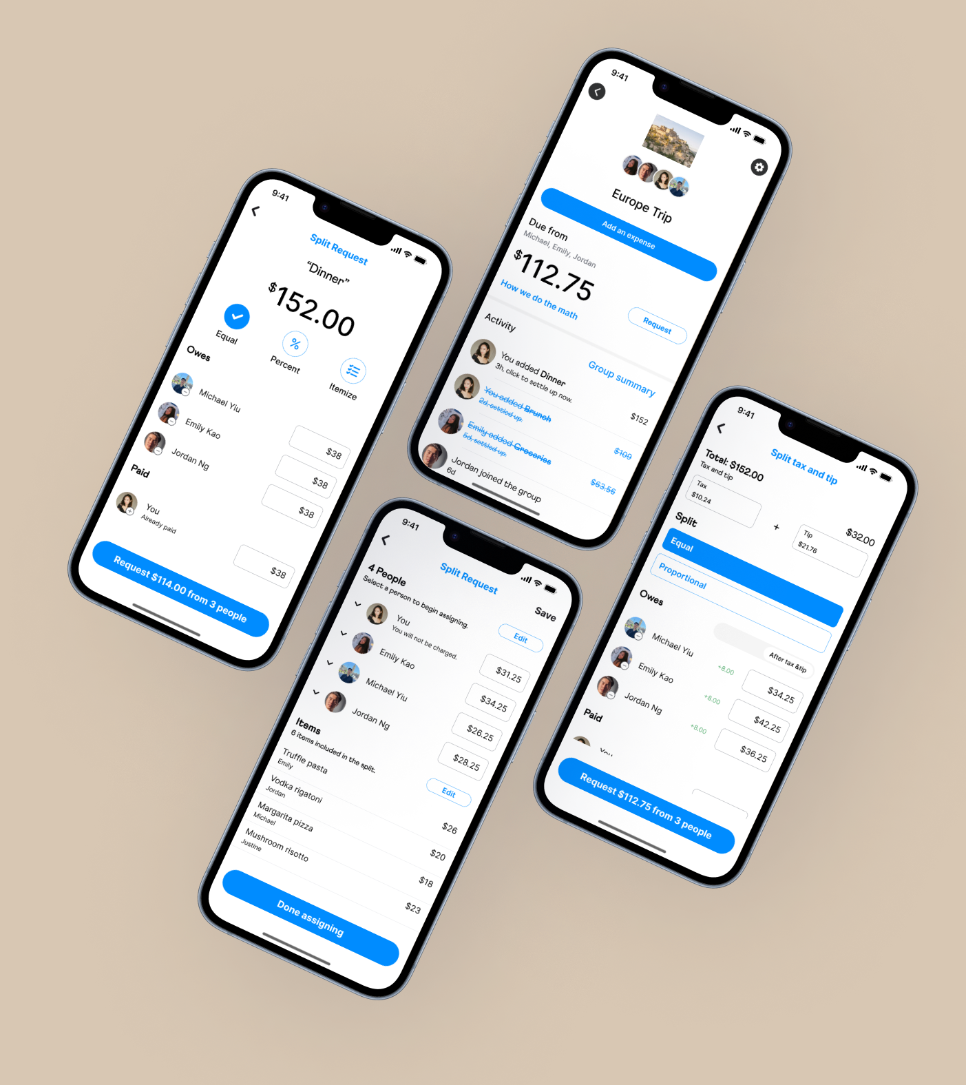
High-Fidelity Wireframes:
During my sketching process, most of my time was spent studying Venmo and its existing UI. I used certain pages such as the main pay/request button where users can then choose to create a group or choose from existing groups already created. I then followed the layout to sketch out the rest of my design to ensure that it is consistent. I did however include a tax/tip split section during this step.

I aimed for a simple and consistent layout for this health app and included only the necessary information so users won’t have too many options to choose from (hence the lack of images, large texts, and limited buttons on each screen.)
I then began to fill in the designs accordingly as shown through the mid-fidelity wireframes:

Before moving on to high-fidelity wireframes, I created a brand style tile that includes the color palette, typeface selection, icons, and various components I plan to utilize. I wanted to include analogous colors blue and green in my palette as these colors evoke a sense of growth, trust, and empowerment, all while maintaining a peaceful, calming interface that relieves stress from users.

During this step, I implemented the brand style guide to my mid-fidelity wireframe:

I also added an extra step which will allow users to book their appointment directly from their overdue appointments so that they do not need to enter the information themselves.
TESTING
Priority Revisions:
Final Prototype:
As this project was an iterative process, I wanted to conduct further usability testing on my high-fidelity wireframes to catch any further issues that I may have missed. I presented five participants with a working prototype and four tasks that they must complete. I then followed up with some questions at the end of the testing. From there, I was able to formulate some areas of improvement and brainstorm ideas for each area:
Streamline the appointment booking process
Solution: remove unnecessary pages
Make the interface more cohesive
Solution: add more colors and images to
Prototype more features
Solution: fine-tune buttons, menu screens, pop-up screens, etc.
You can view the full analysis here!
You may notice that this prototype is designed for the iPhone 8 Plus display. I did not realize until late into my design that I should have designed for the most recent model. I found myself having to modify the home screen for the sake of having an up-to-date cover photo. This is a mistake that I will be sure not to make for my future projects.
You can view the final prototype here!
Conclusion
Extra Flows:
Future Plans:
Takeaways & Learnings:
As I was designing my main flows and conducting usability tests, there were questions that arised regarding certain features that I had not prototyped. To make things easier for users to understand, I prototyped 2 extra flows to showcase the solutions I had in mind. Although these are not included in the final task flows, these extra flows help demonstrate how this new feature would function as a whole.
If I had more time on this project, some changes I would make for the future include adding the tax & tip options for both the “equal split” and “percentage split” flows and not just the “itemize” step. That would mean that the calculations would be done based on the subtotal rather than the total, and users would be able to select how they would like to settle the tax and tip. Some other features I would love to include would be allowing people to send multiple reminders to people who have not yet paid them back.
I am very proud of how this design turned out. My skills have developed significantly since the last project, especially in terms of my prototyping skills, as I have learned more about utilizing components and variants to speed up the process. Overall, I felt a lot more comfortable with the design process and was able to complete this project within 8 weeks, even though I allotted myself 10 weeks. This project taught me how to focus on areas that take me more time to complete and to create an even more accurate timeline for myself for future projects.
One of the challenges I ran into was ensuring this feature could truly blend into Venmo’s existing UI. However the more I examined the app, the more I noticed subtle inconsistencies with the interface. Because of this, I decided to utilize elements similar to the existing layout and made sure that the icons and components that I worked on were consistent.
In the future, I strive to hone my prototyping skills and learn how to create a fully functional design. This includes learning more about how to fully utilize auto layout and how to make each page and button respond the way that I want it to. I am excited to see what’s in store and I’ll see you in my next project!